
At Ravenous Mantis, I was part of the core creative team tasked with helping Cushman & Wakefield evolve their brand through a new platform: “Better Never Settles.” The campaign aimed to communicate the company’s ongoing pursuit of excellence across global real estate markets, and our challenge was to give this positioning a visual system that was both elevated and adaptable.
Defining the Visual System
Working closely with the creative and art directors, I helped conceptualise and define the campaign’s visual foundation. We developed a comprehensive brand platform playbook that set the tone for the campaign—from art direction and layout principles to imagery and messaging guidelines. The goal was to provide a cohesive framework that Cushman & Wakefield’s internal teams could confidently implement and adapt.

Brand Platform Playbook delivered for client’s in-house team use
Advertising Concepts Across Formats
I also designed a series of ad concepts for out-of-home, print, digital, and paid media, establishing a visual system that balanced bold messaging with modern, minimal layouts. These prototypes illustrated how the brand could show up consistently across touchpoints, offering a library of reference layouts and composition examples for internal adaptation.


Digital Explorations
In parallel, I worked on website and email design concepts, aligning digital formats with the new campaign look and feel. These exploratory layouts focused on clear hierarchy, strong headlines, and confident use of space—meant to guide future digital implementation by the client’s in-house teams.

Website concept with new campaign identity

Weekly digest email concept
Our work set the stage for Cushman & Wakefield’s global rollout of “Better Never Settles.” While the final in-market materials were adapted by their internal design team, the direction and structure we created gave them a strong, unified platform to build from. It was a campaign built to grow—and built to last.
Better Never Settles campaign live in NYC
Appendix
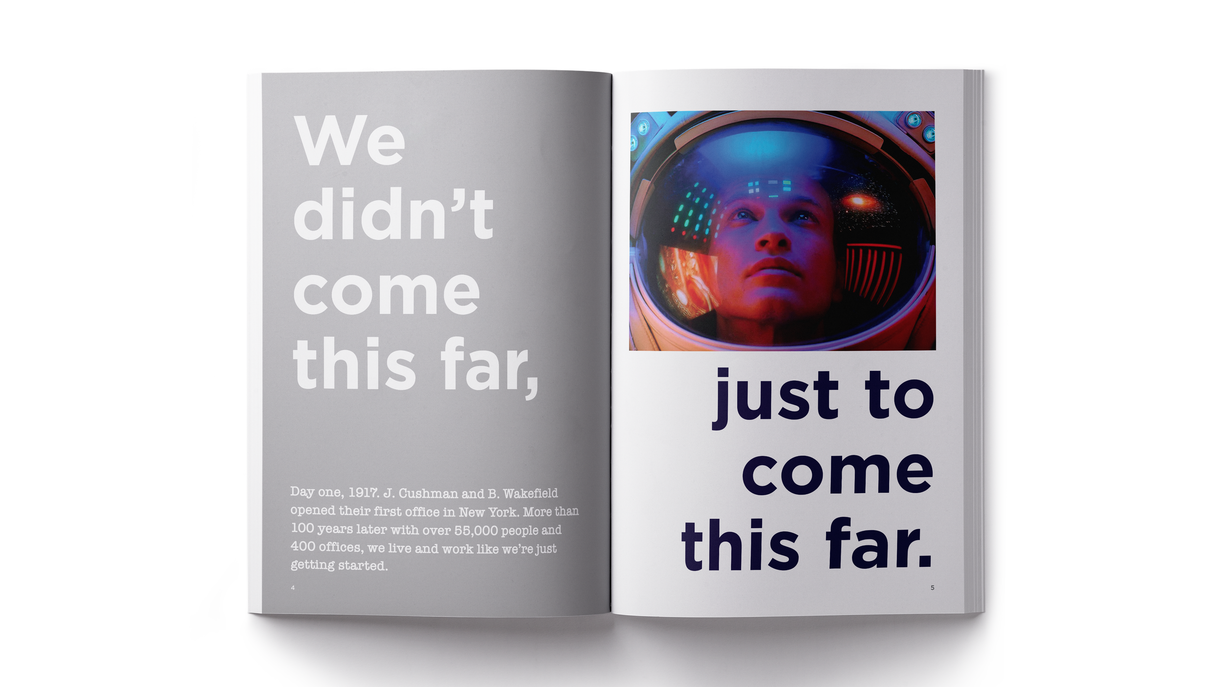
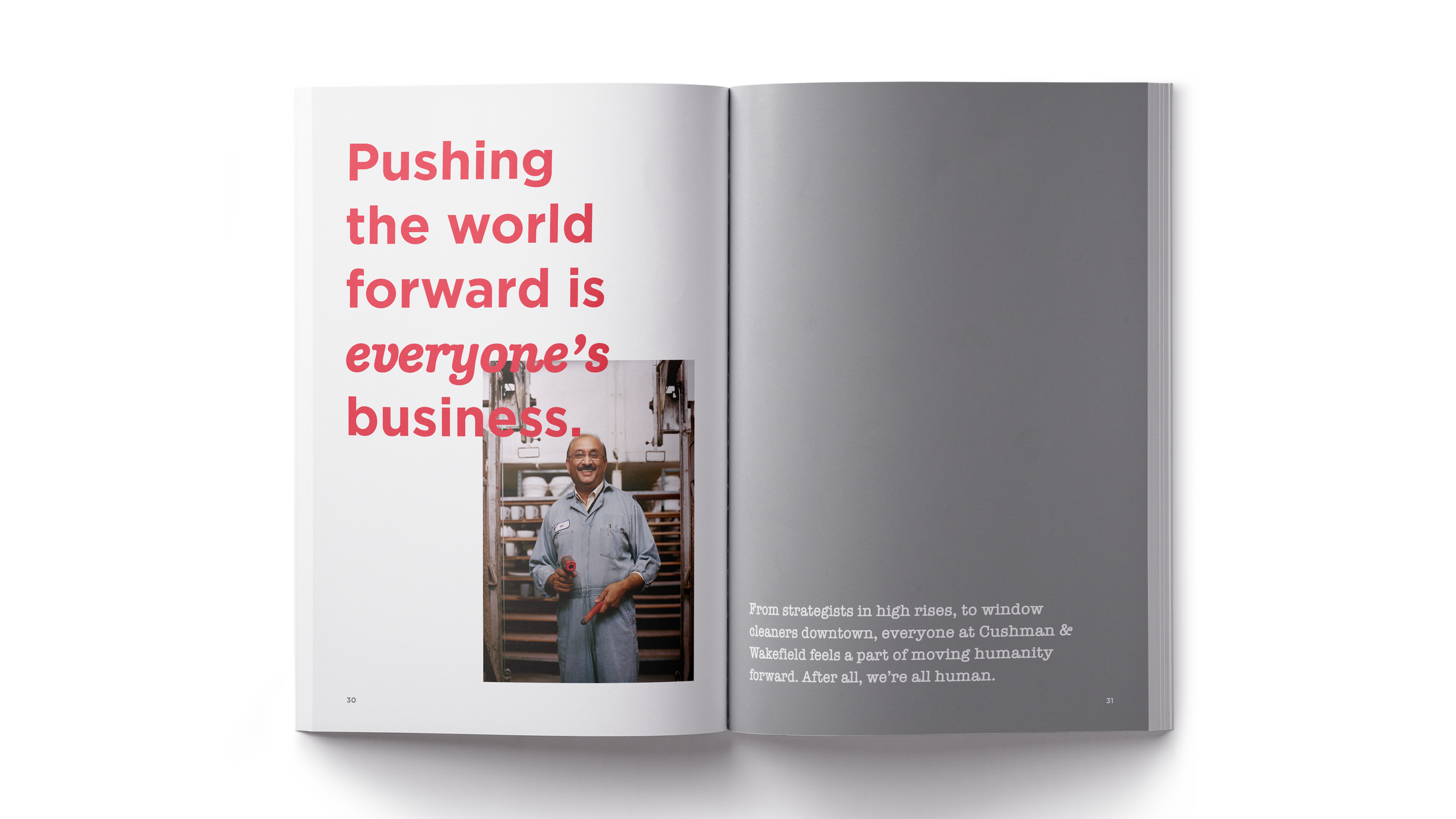
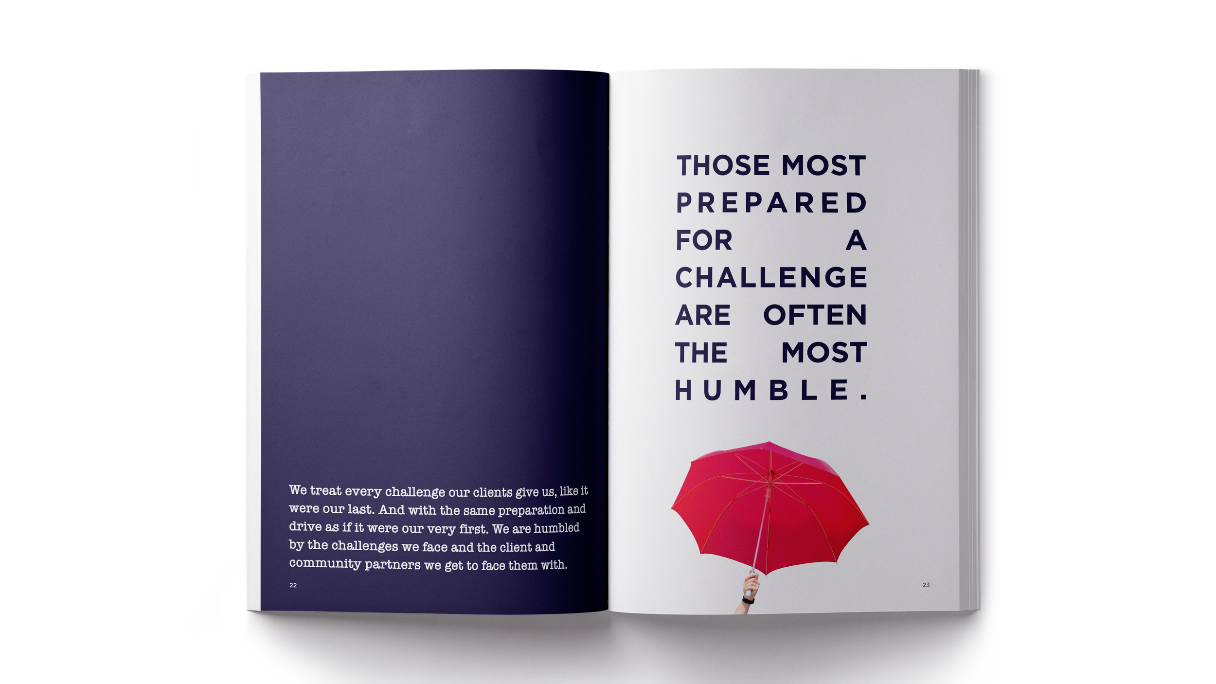
Purpose Book (Internal Use)

Alongside the campaign development, I also designed a printed Purpose Book—an internal-facing piece created to inspire teams around Cushman & Wakefield’s mission and values. The book blended editorial storytelling with compelling visual structure, reinforcing the strategic foundation behind “Better Never Settles.”
The final piece was printed and distributed internally, offering employees a tangible representation of the brand’s evolution and its long-term vision.


Design System for Internal Teams
As part of the post-campaign rollout, we developed a unified design system to help Cushman & Wakefield teams apply the new visual identity consistently across internal and external materials. This included editable InDesign and PowerPoint templates for brochures, one-pagers, and presentations, tailored specifically for the Retail and Multifamily divisions. Designed for both designers and non-designers, the toolkit balanced clarity with flexibility while allowing for subtle differentiation across service lines—ensuring the campaign’s sophistication and confidence carried through to business-as-usual communications.
